Welcome to Limeaid!
The Process:
Research & Design
Affinity Mapping
To start building Limeaid, we first collected data that would be relevant in the app and ranked them from most important to least, this was the order we came up with: Services, Experience, Quality, Merchandise, Time, Price, Locations, Options.
User Persona
A user profile was then created to help focus on issues a specific group of people may encounter when using the app. I created Helen Marchand, a retired French nurse who aspires to open a bakery, but has problems with her eyesight and driving due to her age. To resolve this, I would keep in mind that Limeaid’s text size can’t be too small and the design would have to be bright.
(Sketch) User flow
After mapping out the user preferences and problems , I started to sketch out some pages of the app itself. I listed out the properties that would be applied to each page and drafted out the first user flow chart. None of the designs were made in this step yet.
(Digital) User Flow
After creating the basic design template of the app on paper, I moved the contents onto the screen and labeled each button/page to get a better understanding of what each element is responsible for. At this point of the process, I had a general idea for what I wanted the app to look like, which is why some of the buttons can be seen.
Moodboard | Elements
With the template finalized, I was able to move onto the design. I created a moodboard with the app's color scheme, along with a basic structure of what the buttons would look like. I wanted Limeaid to have a "refreshing" essence that reminded people of Summer, so I chose bright (but not overwhelmingly) colors. The buttons were also designed to be more rounded to match the organic forms of the typeface and branding pattern.
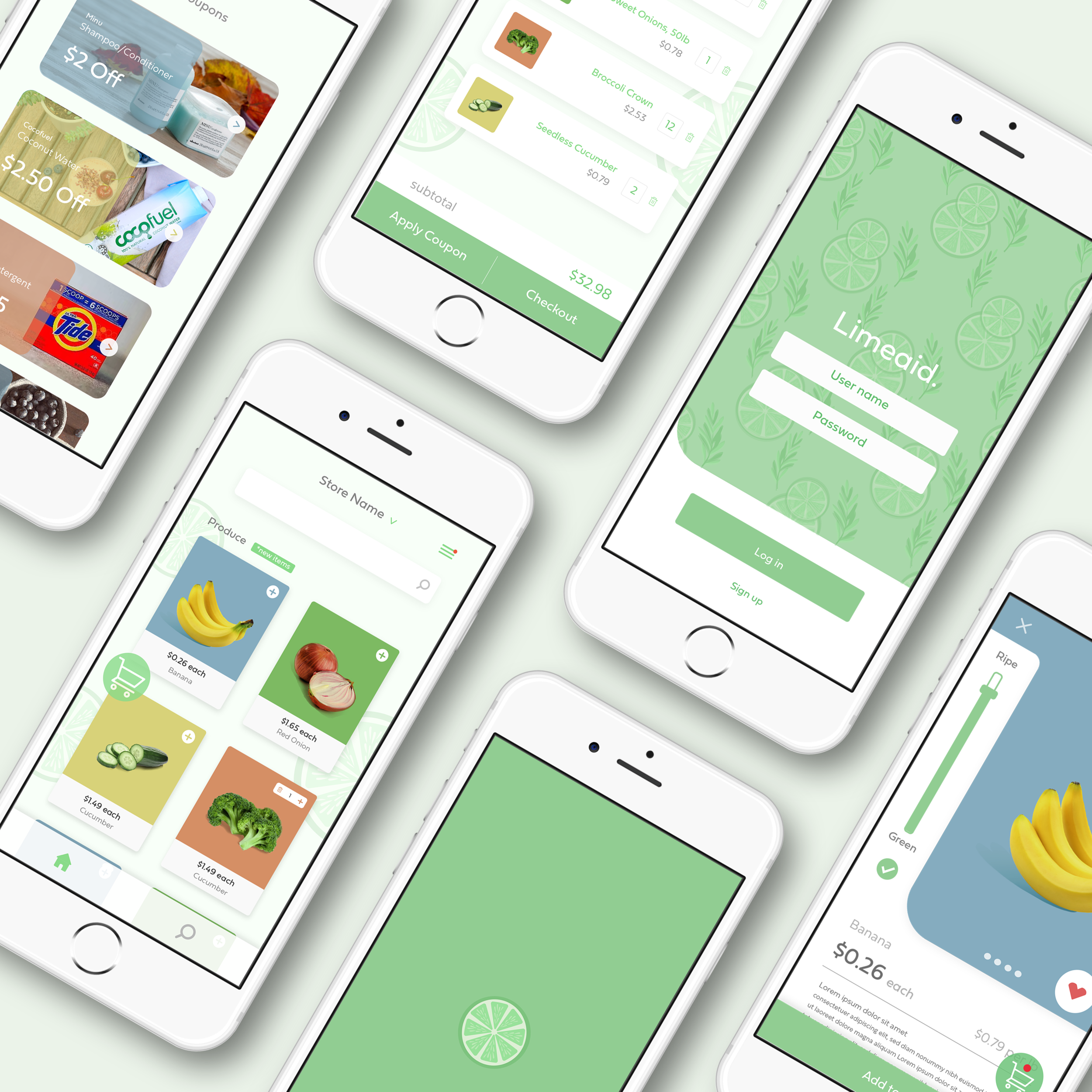
Creating
This was the first design of Limeaid. The primary choice of color was green and there was a mixed combination of illustrations and photography. Most of the elements were kept in the final design but with an updated and cleaner style.


