Welcome to Noomy Coffee!
Press play to watch this scroll through of the desktop design!
Homepage Design: The process
Research:
Who is Noomy? and what are their design goals?
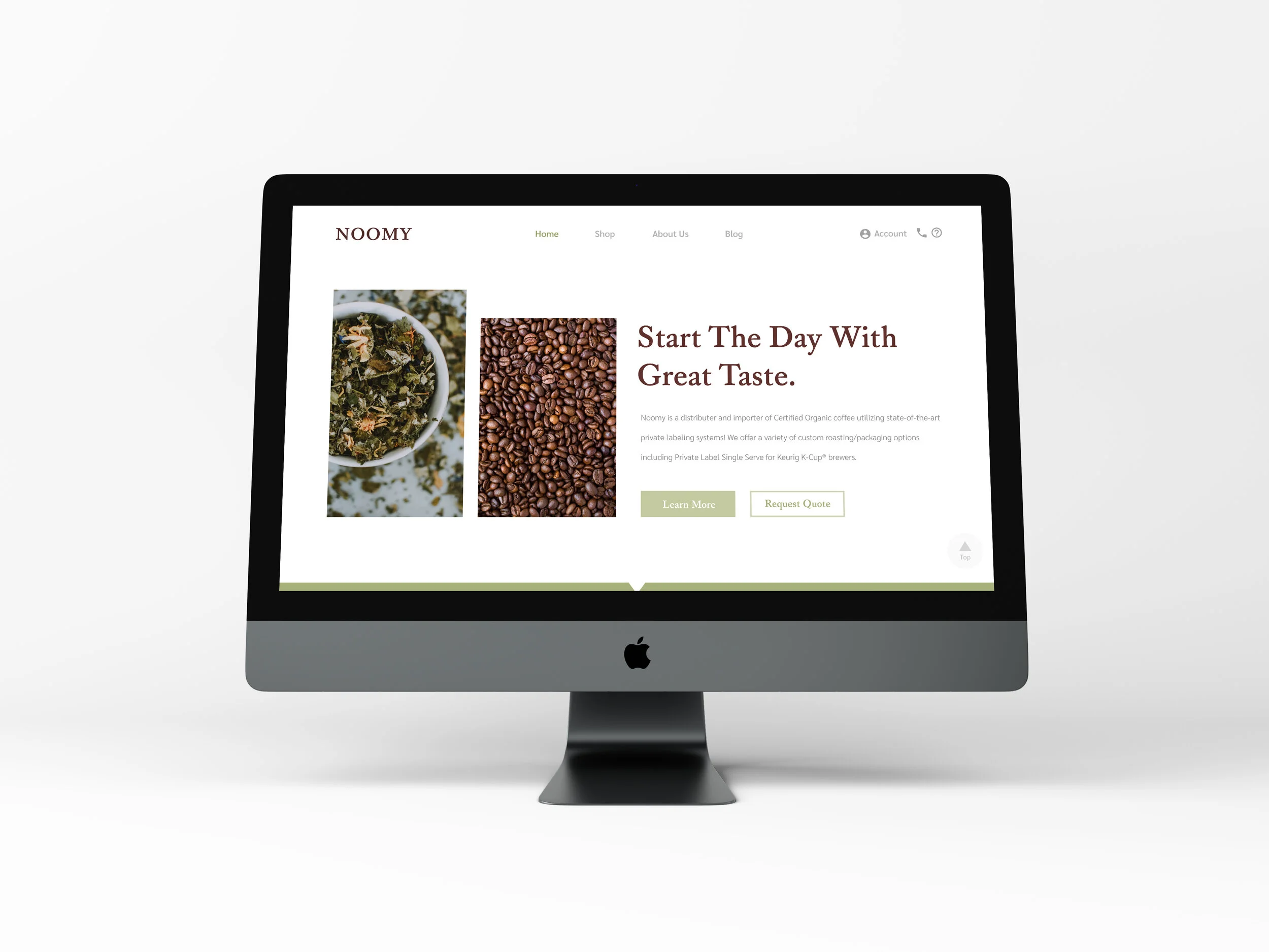
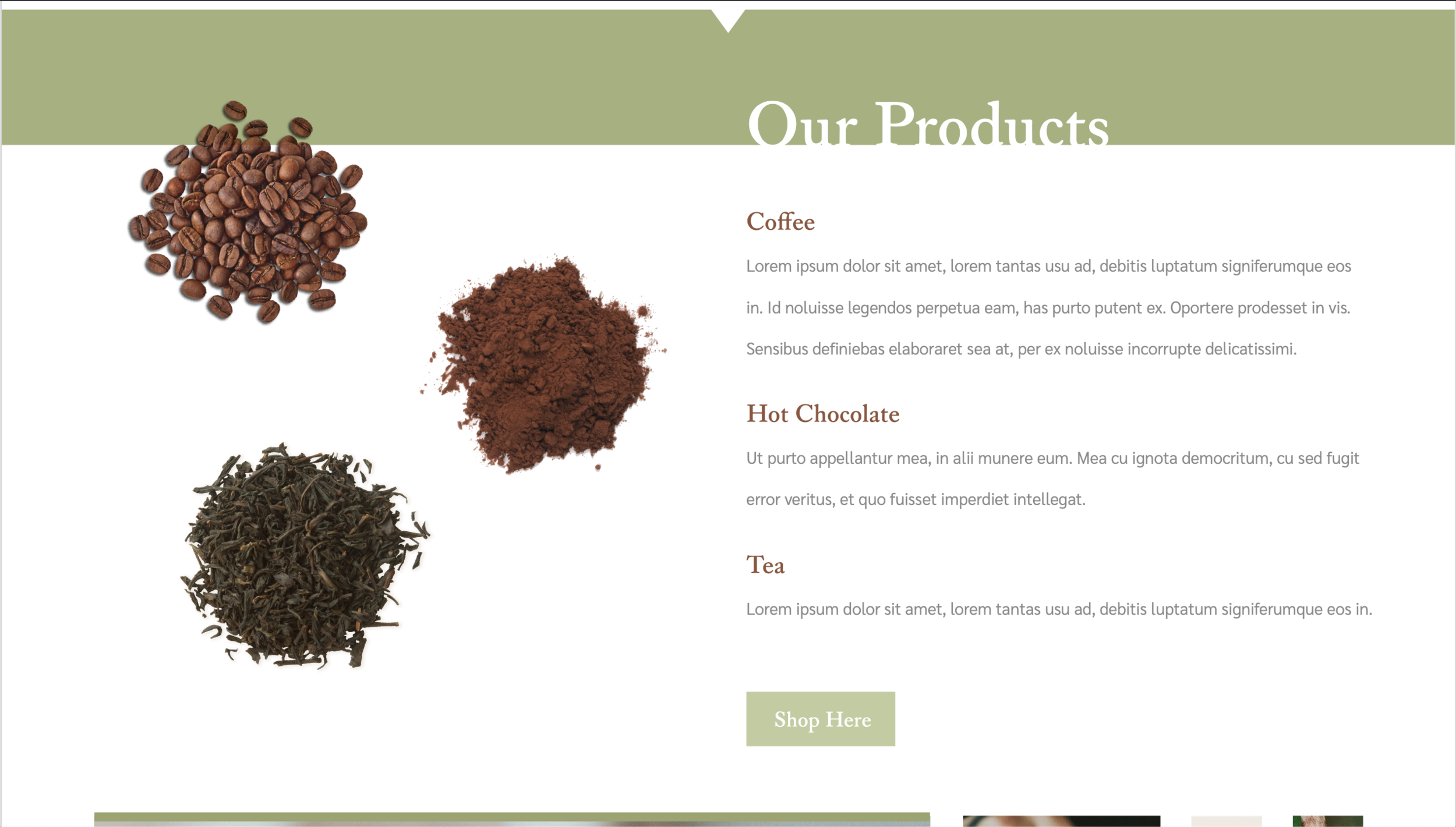
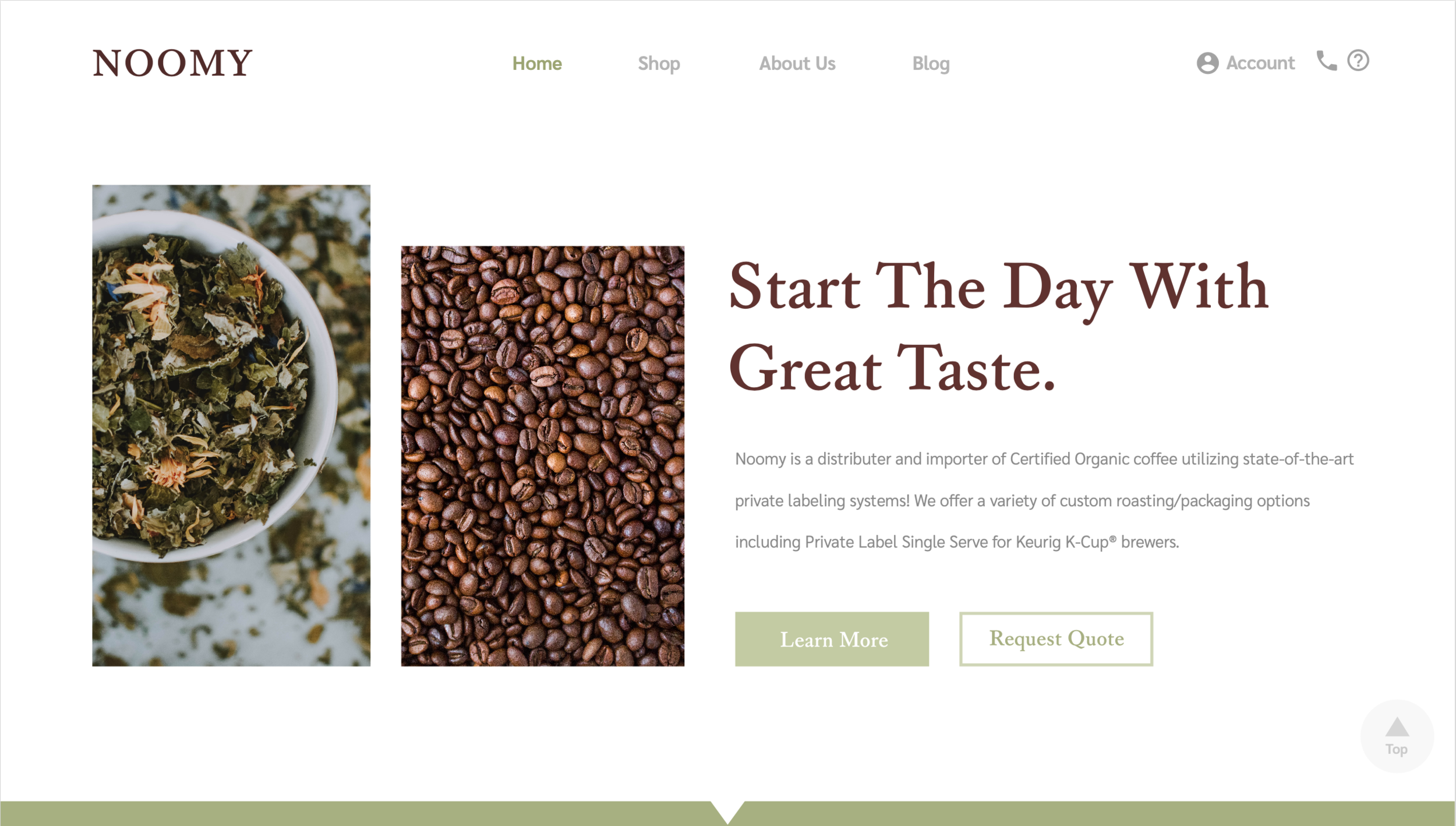
We are a distributer and importer of Certified Organic coffee utilizing state-of-the-art private labeling systems. We offer a variety of custom roasting/packaging options including Private Label Single Serve for Keurig K-Cup® brewers. Products include coffee beans, hot chocolate, and loose leaf tea.
Impression left on visitors when visiting website
Customs
Luxury
High end
Organic
Modern
Site’s desired look and feel
Clean
Modern
Hipster
Rich
Bold
Important call to action buttons
Register for an account
Request a quote
Signup for emails
Reach out to a sales representative
Help is reachable
Important sections of content
About us
History of our company
Quality of beans/where our beans come from and what we do to promote social awareness
Brands that currently white label with us
Inspiration - The Good


Inspiration - the Bad and the Ugly


Observations and thought process:
Before developing the design for Noomy’s homepage, I considered things to avoid by looking at the disliked websites. In order to meet Noomy’s design goal for a clean and modern website, I avoided the following. In Starbucks’website, there was a non-uniform use of colors and excessive animations. Skechers’ website was overcrowded with information and inconsistent in typeface size. Mudpie was the best out of the three, but fell short when sticking to a single or organized typeface. Keeping those in mind, I chose the following for designing Noomy’s homepage…
The Design:


Color Scheme
Starting with the background, I chose to use white in order to balance out the other choices of colors, dark brown, light brown and olive green, which are used for text and other features. These colors were selected to match Noomy’s products, coffee, hot chocolate and tea leaves. By minimizing my color palette to these simple colors, it gave the website a clean and refreshing look that doesn’t overwhelm users with excessive photographs, texts and colors
Typography
While selecting a typeface for the website, it was important for me to choose one that would present Noomy’s products as high-end and luxurious. One of Noomy’s liked websites, Mikimoto, is a company targeted in selling high-end products. They use a serif font throughout their homepage because it is generally known to look more elegant, as compared to Nike’s homepage, which uses a san serifs font for a minimalistic style.
Desktop Design


Mobile Design


Videos
Desktop design
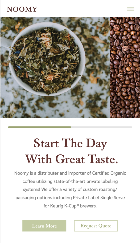
Mobile design